Features
Branding for the modern fire service
Tips for rebranding and refreshing your fire department’s image.
November 18, 2021
By Kirk Hughes
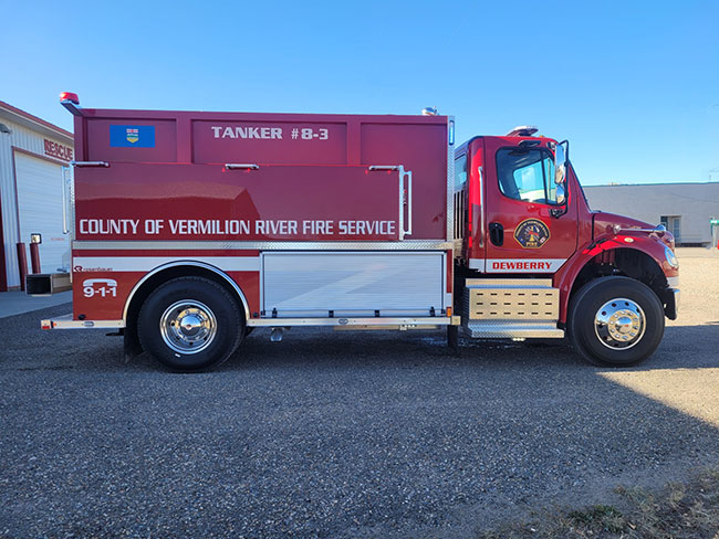 An example of the shoulder crest being used dually, as a logo for the door. Note the colour scheme includes a bottom door rocker indicating a station identifier “Dewberry” and links the regional service with the province through the inclusion of the provincial flag.
ALL PhotoS: Kirk Hughes
An example of the shoulder crest being used dually, as a logo for the door. Note the colour scheme includes a bottom door rocker indicating a station identifier “Dewberry” and links the regional service with the province through the inclusion of the provincial flag.
ALL PhotoS: Kirk Hughes
The life cycle of a fire department is one marked with benchmarks, such as anniversaries, and the people that make them up change over time. The vehicles, training and tools need to adapt and grow to remain viable and relevant as benchmarks go by. These events make up the history of the department, which in turn forms the “culture” or the “soul” of a service. As the makeup of a department is altered, a new sense of ownership is created. It is made up of the traditions of the past, the entrusted legacy of those that came before, and the reputation that was built through adversity and triumph. Since change is inevitable, modernization should be anticipated and embraced. When a fire department moves towards the future, it has a lot of transitional components in play, from leadership movement, acceptance of new technology and forming a new sense of self-identity. When that time comes to contemplate what the department stands for — being mindful of the past, but striving forward towards the future – that is the time to think about branding.
Branding is about putting a public face on your entire service. It’s the way your specific department “talks to people” through visual cues like a shoulder crest and logo or social media presence. Branding is part of how that talk convinces them that you are providing the best emergency service to them at the moment they need it most. Branding is what your department says to the public. When exploring some simple key factors that make up a successful modernization strategy, branding is certainly at the top of the chart. Transitioning away from the past is always a difficult task, but a new shoulder flash, logo/decaling and a sound social media platform can reap dividends in pulling a department into the future.
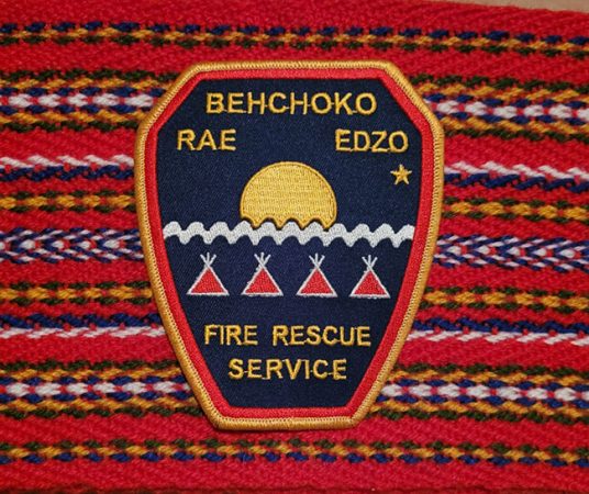
If you look around your fire service, you’ll likely see many examples of ‘brands’: shoulder flashes, door decals, the time-tested Maltese cross, perhaps. All of these are fine representations of traditional branding, but do they speak to the current state of a department? The old generic shoulder flash may have been the solid standard many years ago, but its time is well past and now it’s time to rejuvenate and create a new emblem. This is one of the primary steps when deciding to re-brand: what does a shoulder flash represent to the public? What could it say about the future direction of the organization? This is where the creative juices get to flow. A good re-brand should incorporate the customs associated with the fire service, while blending in the nuances of the modern role of first responders. It should be clean in appearance, not overloaded with too many auditory distractions, contain crisp lettering, clear patterns and be incorporated within a set boundary to look professional and official. A recent practice has been using local landmarks within the centre of the patch, like you see in the FDNY and Toronto Fire patches. These two patches that have instant recognition power due to their branding. In 2015, the Behchoko Fire Department in the Northwest Territories went from the traditional gold threaded Canadian Maltese cross shoulder flash with “Rae-Edzo” embroidered on the top to a modern patch. The catalyst was the adoption of the traditional Aboriginal name of “Behchoko” (Tli-Cho for “The place with the long knives”) from the original name of Rae, named after John Rae the explorer. The new shoulder flash consisted of the Indigenous Tli-Cho First Nation flag superimposed on a shield, with simple text spelling out their roles as a fire and rescue service which also included their non-indigenous names, Rae and Edzo, linking the past with the future. It is a gorgeous crest that spurred additional changes within the service, and lead to a notable brand across the North.
Following up with the shoulder flash is usually a logo – and that could be one in the same. The idea of a logo is that it can be placed on apparatus, such as fire trucks and buildings, and aids in promoting the service in conjunction with the shoulder flash. Many departments use their shoulder flashes on their trucks, tying the personnel and the apparatus together. This is an advisable practice, as it increases brand recognition, however, some departments opt for a stand-alone separate logo, which has also has its merits.
A logo can also be used for letterhead, formal certificates, and public material. Either way, a strong logo connects the administrative side of the house with the operational, ensuring that the public understands that both represent one service. Whether the choice is to use the shoulder flash as the logo, or create a logo, the main point is that they should be used consistently to avoid confusion which lessens the brand power.
A strong patch serves to identify your department, its members and strengthen your brand when people recognize that crest outside of an emergency situation.
From the shoulder to the door, another key component of branding is consistency in application. An affordable way to deliver brand recognition is in the decaling of apparatus, this is especially important when dealing with more than one station, such as in a regional system when the service is made up of more than one fire district. In those situations, you want the public to identify your emblem, be it on a firefighter or on a piece of apparatus, but also strengthen the individual mark of a particular region or district. That means highlighting the differences, like a village station name, in a manner that is uniform to other trucks within the service. This creates a link between all, but showcases the geographical diversity of others. By standardizing the colour schemes and decal placements, the brand remains strongly linked to the entire service, while the uniqueness of a particular station or district is enhanced. This, in turn, reinforces the brand identity by promoting diversity within similarities. A neat marketing strategy and a sure-fire way to heighten brand recognition.
Linking a new shoulder flash, logo and apparatus scheme together in a nice little package is a strong social media platform. The most widespread way to connect with rate payers and residents alike is through the use of online networks to share current events, showcase exceptional work, educate and inform followers. It is also the perfect arena to display the brand and market it. Getting the message out to as many people as possible through “likes” and “shares” raises awareness of the brand and helps with the consumption of the media to the public. Once people associate a particular branding campaign with the fire service, it aids in building trust through familiarity and spins off so many other positives, like recruiting and donations. Most social media platforms are free, with just time and effort needed to polish it to gain the public’s attention. As a branding technique, social media networking remains one of the top ways to sell a brand concept.
Although a comprehensive marketing program can take many complicated forms, and even an evolving branding campaign takes time, forethought and energy, the first steps are generally the most beneficial. Creating a meaningful, sleek and modern patch is a simplistic way to begin the evolution of a fire department culture. A logo and colouring scheme aid in extending the brand outreach, as they are usually seen out in the public, either at emergency calls or public relations events, and a well-built social media presence heightens the brand awareness. Combined, these projects form the beginning of a modern branding program that builds public confidence, while encasing a sense of pride in the membership of that service. A brand is more than just a logo or crest, it’s a reflection of the attitude of the people that wear it, and to the people that see it in their time of need, it is a symbol of professionalism and relief that help has arrived.
Kirk Hughes is the Director of Protective Services and the Fire Chief for the County of Vermilion River in Alberta, Canada. Kirk previously served in the Royal Canadian Mounted Police as well as several fire services across Ontario, Manitoba, the NWT and Alberta. His Facebook page is can be found at Protective Services – County of Vermilion River.
Print this page