Features
Improving efficiency with data
A case study on how Burlington Fire Department in Ontario uses data analytics and GIS spatial analysis to drive performance
November 15, 2019
By Jin Y Xie
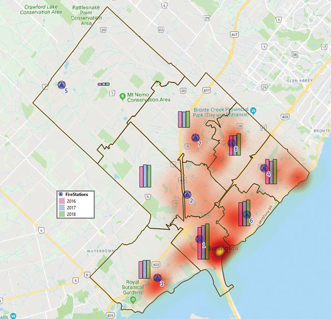 Figure 1: Total incidents by stations (2016 to 2018).
 Burlington Fire Department in Ontario serves a city population nearing 200,000 and earned itself the top seat on MacLean’s Best Communities in Canada list this year. In addition to the base population, Burlington Fire provides mutual or automatic aid with neighbouring municipalities. The department’s goal is to save lives, preserve the environment and protect properties. Like anywhere else, the incidence of real fires (including structure, non-structure and vehicle) are a much smaller percentage of calls than they used to be. The services have extended from fire suppression to medical emergency, motor vehicle accidents, rescue, hazardous materials, fire prevention, inspections, etc. To serve its community best, Burlington Fire uses data analytics and GIS spatial analysis to drive the department’s operations and make the performance more efficient.
Data plays a vital role in emergency response. When a 911 call is received, it is automatically captured in the Computer Aided Dispatch (CAD) system and is processed by dispatchers in a timely manner so that the closest available resources will be sent to the incident. The associate information about the incident is eventually transferred to the Records Management System (RMS) for command officers to review, comment and sign off. The data entailed could also be analyzed later to answer important questions. However, due to lack of capacity of visualization, it takes resources to sift through the data and discover meaningful information to support making data-driven decisions and improve performance. I recently conducted a case study of the last three years of data (2016 to 2018).
Visualization is the key to success
In emergency services, nothing can beat visual representation. The geographical distribution and spatial or temporal patterns are always used to show trends, correlations and patterns by exploring the data. Since the number of incidents are so large, simply plotting the data on the map won’t show meaningful trends to decision-makers. Instead, I created a heat map (kernel density estimation) in QGIS. The heatmap is most commonly used to visualize incidents density geographically so that the patterns of higher than average occurrence can emerge.
Once the heat map is created, it can always be used as a base map for reference when doing analysis. Figure 1 shows the heat map as a background reference for the statistics chart of the total incidents in the eight fire stations on the map across the entire city. Among the stations, most of them are in an urban area. Only Station 5 is in rural area and it is mainly used by volunteer firefighters.

Figure 2: Incidents (Code 2 from 2016 to 2018) turned out in more than 80 seconds by platoons and stations.
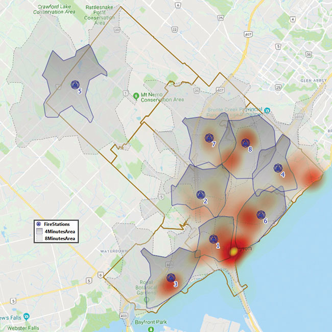
Figure 3: Heat map with station covering area in four minutes and eight minutes.
Time is Crucial
The Code 2 incidents are time critical, involving all lights and sirens. When talking about performance in fire, I am referring to the Code 2 cases. The total response time is used for performance measure. It is the time from the call received until the first truck arrives on the scene. Response time is composed of three elements: call handling time, turnout time and travel time. Properly analyzing the three elements can provide decision makers with a complete picture of the response process to improve the performance.
First, the call handling time is the elapsed time it takes to answer and process a call and dispatch trucks. Specified by the NFPA, the best practice for call handling time should be less than 60 seconds of 80 per cent. The average call handling time was around 50 seconds in the past three years. How can it be kept or even improved? We all know technology advancements can help to improve call handling time. Regardless of spending money on the technologies, let’s look at those incidents that didn’t meet the NFPA’s standard for call handling time. As all the calls are handled at centralized communications, day and time are the major factors that affects the performance. I created a cohort chart of temporal heat map that shows the pattern by the hour of day and the day of the week. The darker the red is, the higher the occurrence is of the incident (which has more than 60 seconds call handling time). This information could provide the management with a clue why higher rates happened in certain times and days, and find a way to improve on this through education or better processes.
Second, the turnout time is the elapsed time from the tune to the trucks leaving the station. When a fire truck is dispatched to an incident, the station’s alert tune sounds at the same time and firefighters rush out to their truck and leave. Standardized by the NFPA, the turnout time should be less than 80 seconds of 90 per cent. In the past, the average turnout time is less than 80 seconds every year. Can it be kept or bettered? Looking into the incidents that didn’t meet the NFPA’s standard of turnout time would give the decision makers an idea where to find the room to improve directly. Since the firefighters are working as members of a platoon at different fire stations, Figure 2 shows the pattern of spatial distribution by platoons and by stations for those incidents that need to improve on turnout time.
Last, the travel time is the elapsed time from when a truck starts to respond until its arrival on the scene. Based on the requirement of NFPA, the standard travel times are four minutes for first-due trucks and eight minutes for full assignments. Due to the complexity, I am not going to delve too deep on the travel times. Travel times vary and depend on population densities, road traffic volumes, and road conditions like potholes and speed bumps, etc. Rather, I’ll focus on the role that I can play by using the technology without additional resources. Using the big data collected by the Open Route Service and Open Street Map Service, the estimated cover area driving from stations in four minutes and eight minutes are created in GIS as a layer. By overlaying this layer with the heat map generated from the raw incident data, it gives the decision maker a picture of where is covered in four minutes driving time and where is covered in the eight minutes driving time (Figure 3).
This case study was created using free open source software.
Jin Y. Xie is a PhD and GIS specialist. He has over 16 years of experience, including working for police, fire, Ontario municipalities and Saskatchewan Wildfire Management. Xie is currently an application analyst serving Burlington Fire and Rescue.
Print this page